Social Media

Copyright 2021 Adele Nguedia. All Rights Reserved

WIC Student Registration

WIC runs an admissions-based program with a steady flow of students. The existing registration and eligibility evaluation process relied on multiple tools, manual handoffs, and repeated data entry, creating operational strain for administrators and long wait times for students.

6.4x

faster application completion

98%

increase in admin efficiency

3x

decrease in associated cost

Overview

Project Manager
Product Designer
UI/UX Researcher
Front-end Developer

This project involved the end-to-end redesign of the student registration process: from online student application to eligibility evaluation and application feedback. We simplified the registration process for students, streamlined the administrative workflow for reviewing, managing, and processing applications, and significantly reduced operational cost, all while maintaining trust and fairness.

Methods: User & Stakeholder Interviews, Job Shadowing, Workflow Mapping, Iterative Prototyping, Usability Testing

Research
& Discovery

Women in an office working together

01

Stakeholder interviews

We interviewed leadership, marketing, and admissions staff to understand the business goals, operational requirements, and day-to-day operations and challenges. We also shadowed 4 administrators over 5 business days, documenting how applications moved through the process and the workarounds they had developed to keep things moving.

02

User research

We interviewed 20+ applicants, including people who completed the process and people who abandoned it, to understand their experience and where expectations broke down. We completed the registration process multiple times both as applicants and administrators, timed each step, mapped every system involved, and documented everything.

03

Workflow Mapping

With our findings, we were able to map every step from registration through eligibility evaluation, including the systems involved, data entry, hand-offs, and workarounds. This helped distinguish UI problems from problems in the underlying process, and created a solid foundation for deriving a working scalable solution.

Our Findings

WIC’s existing workflow relied on too many disconnected tools

Multiple steps across platforms
The process moves students and data across different tools, increasing errors, data loss, abandoned submissions, and risk of interception by malicious actors.

Repeated data entry:
Students enter the same information multiple times in different forms, adding frustration and extra work for admins who have to sort through and make sense of everything.

Long delays between submission and response:
Students spend 45–60 minutes over multiple sessions to apply, and admin review can take weeks, creating large backlogs and frustration for both students and admins.

Scattered data across tools:
Data is fragmented, making it hard to track, manage, or ensure consistency.

Manual decision-making:
The process relies very heavily on human input for application progress, evaluation and feedback. Relying on humans for every step increases the likelihood of mistakes.

Tedious and time-consuming for admins:
Hundreds of applications are received monthly, and these require a team of 10–15 people to process manually.

4800+

applications waiting to be processed

52.5m

application completion time over multiple days (students)

90m

application processing time, spread over multiple weeks

100+

student application status inquiries per day

1000s

of dollars spent monthly on various tools

No

established system for sharing application status

2.3%

conversion rate from visitor to basic form

43%

conversion rate from basic form to eligibility form

Design Goals

How would we simplify the system end-to-end to reduce friction for both admins and students

Make the registration process easier for students

Reduce friction in the registration process for students so that they can complete their applications fast, and with as little hassle as possible.

Help admins process student applications faster

Increase application processing efficiency, as well as accuracy in the decision-making process, while preserving trust and maintaining fairness in key decision points.

Reduce operational cost and data risk

Make the student registration and application evaluation process cost-efficient, reliable and easy to scale, while maintaining data integrity

Leading a cross-functional team to create a scalable product without increasing risk 

The project began as a website redesign. As part of that work, the client asked if we could improve student registration to “make it feel less clunky and outdated”. As we dug deeper however, it became clear that the interface was just part of the problem.

After research and discovery, we synthesised our notes and started working on an updated workflow. We used workflow diagrams and wireframes to test and validate our initial ideas, then created low-fi prototypes to help the stakeholders understand our vision for the updated registration system.

To avoid disruptions to their current activities, we created a sandbox where we could build a working prototype. After several iterations and multiple rounds of testing, we were able to build a much more efficient system and deploy it with little to no downtime.

Planning the student registration portal
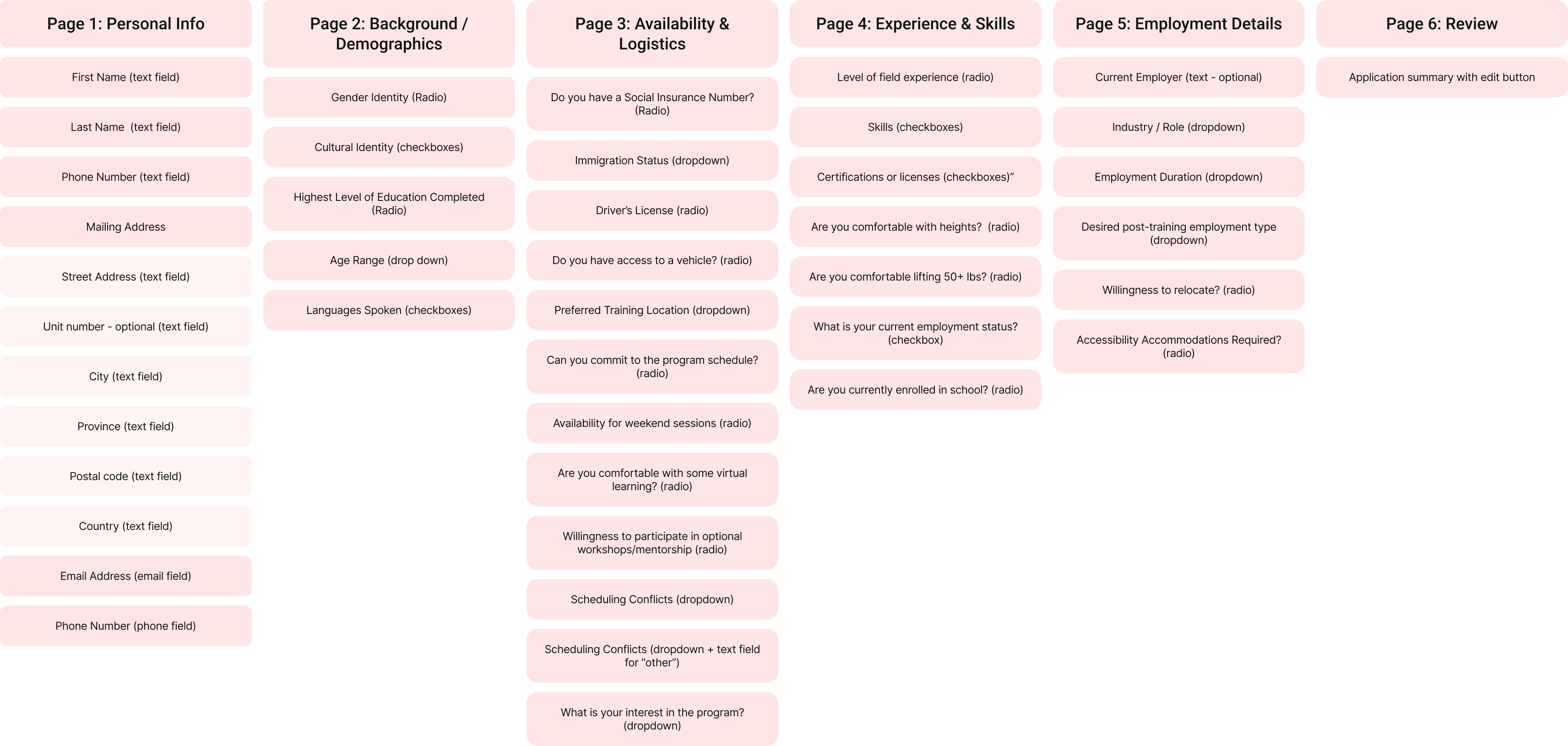
Student registration flow planning
Woman working on a laptop at a cafe
First Outcome

Students can now complete their applications in one session

Woman working on a laptop at a cafe

One multistep registration form

Lorem Ipsum is simply dummy text of the printing and typesetting industry. Lorem Ipsum has been the industrys standard dummy text ever since the 1500s, when an unknown printer took a galley of type and scrambled it to make a type specimen book.

Woman working on a laptop at a cafe

One multistep registration form

Lorem Ipsum is simply dummy text of the printing and typesetting industry. Lorem Ipsum has been the industrys standard dummy text ever since the 1500s, when an unknown printer took a galley of type and scrambled it to make a type specimen book.

Woman working on a laptop at a cafe

One multistep registration form

Lorem Ipsum is simply dummy text of the printing and typesetting industry. Lorem Ipsum has been the industrys standard dummy text ever since the 1500s, when an unknown printer took a galley of type and scrambled it to make a type specimen book.

Students can now complete their applications in one session

Instead of having the students fill out a basic form, then waiting for an admin to review that submission and craft an email to send out to the student with next steps and more forms to fill, we designed a multistep form that they could fill in one 10-15mins session.

Here goes your title

Lorem Ipsum is simply dummy text of the printing and typesetting industry. Lorem Ipsum has been the industrys standard dummy text ever since the 1500s.

Here goes your title

Lorem Ipsum is simply dummy text of the printing and typesetting industry. Lorem Ipsum has been the industrys standard dummy text ever since the 1500s.

Here goes your title

Lorem Ipsum is simply dummy text of the printing and typesetting industry. Lorem Ipsum has been the industrys standard dummy text ever since the 1500s.

Students can now complete their applications in one session

Instead of having the students fill out a basic form, then waiting for an admin to review that submission and craft an email to send out to the student with next steps and more forms to fill, we designed a multistep form that they could fill in one 10-15mins session.

Here goes your title

Lorem Ipsum is simply dummy text of the printing and typesetting industry. Lorem Ipsum has been the industrys standard dummy text ever since the 1500s.

Here goes your title

Lorem Ipsum is simply dummy text of the printing and typesetting industry. Lorem Ipsum has been the industrys standard dummy text ever since the 1500s.

Here goes your title

Lorem Ipsum is simply dummy text of the printing and typesetting industry. Lorem Ipsum has been the industrys standard dummy text ever since the 1500s.

African American woman working on a laptop

For Students

Faster application completion time:
Because there are now fewer steps, fewer redirects and clearer expectations, application completion time has dropped from 45–60 minutes across multiple days–weeks, and multiple platforms to 10–15 minutes in one session and on a single platform.

Better feedback – 95–99%+ reduction in application status inquiries (Reduced frustration and uncertainty):
The number of “did you get my application” emails dropped from hundreds weekly to almost none as students receive immediate on-page and email confirmation.

Greater confidence in the legitimacy of the process and the organization:
Students now feel more confident they are not at risk of scams, and they trust the organization more based on the streamlined, professional application experience.

Perceive fairness and professionalism, reinforcing trust:
The subtle layer of automation allows the students to enjoy the faster application processing while maintaining trust in the organization’s fairness and human touch in reviewing their applications.

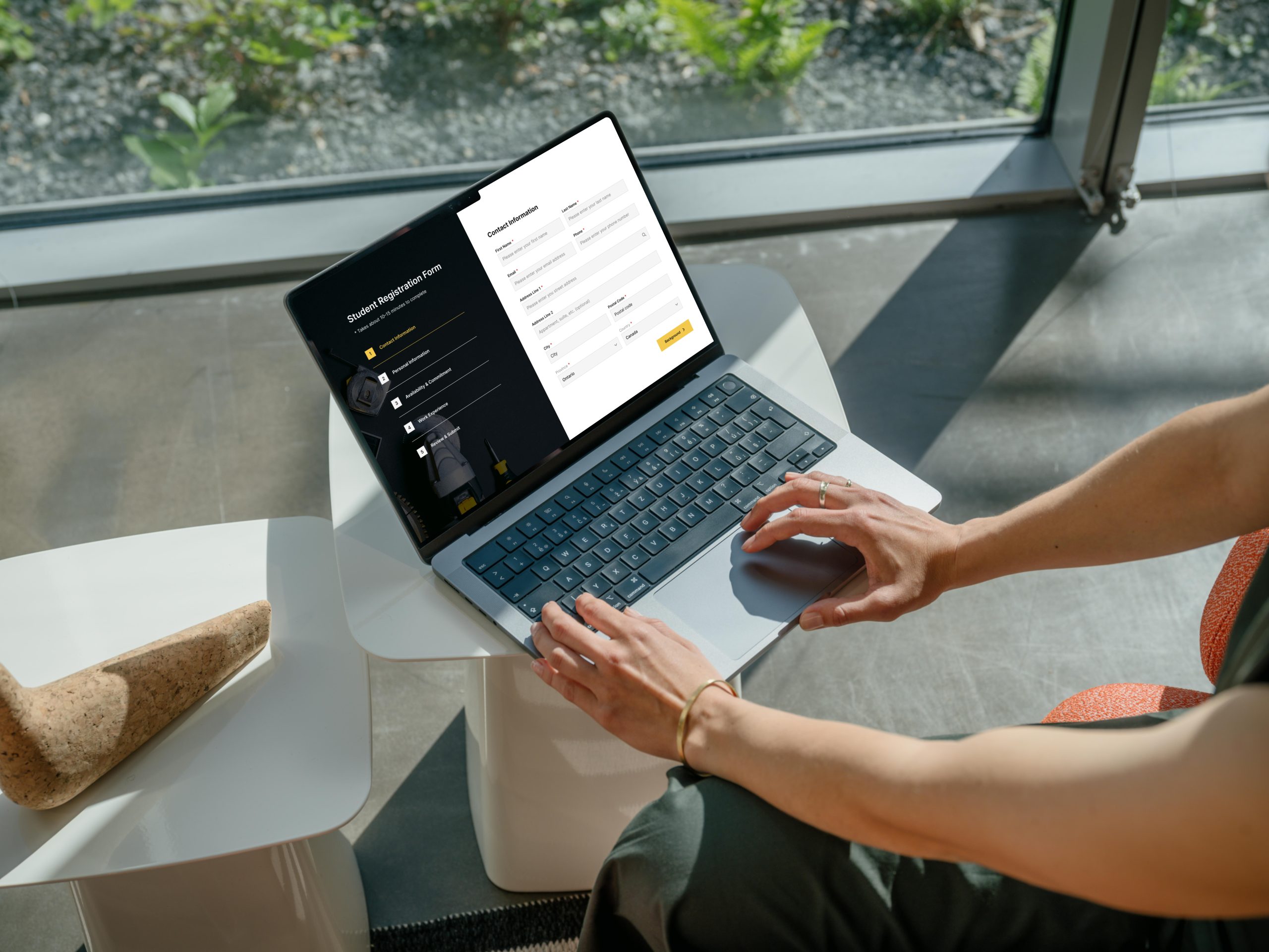
Contact information form

Students can now complete their applications in one session

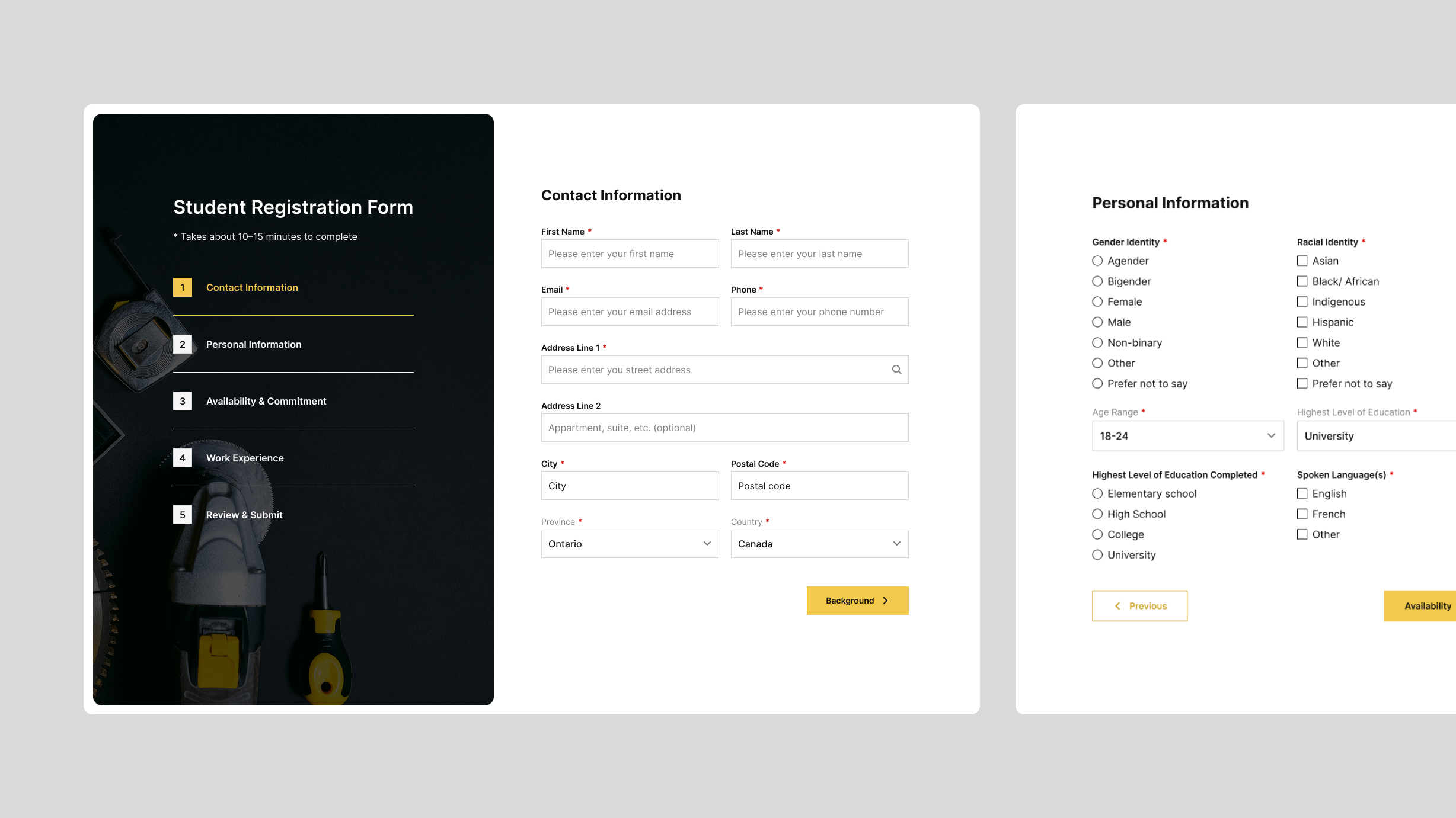
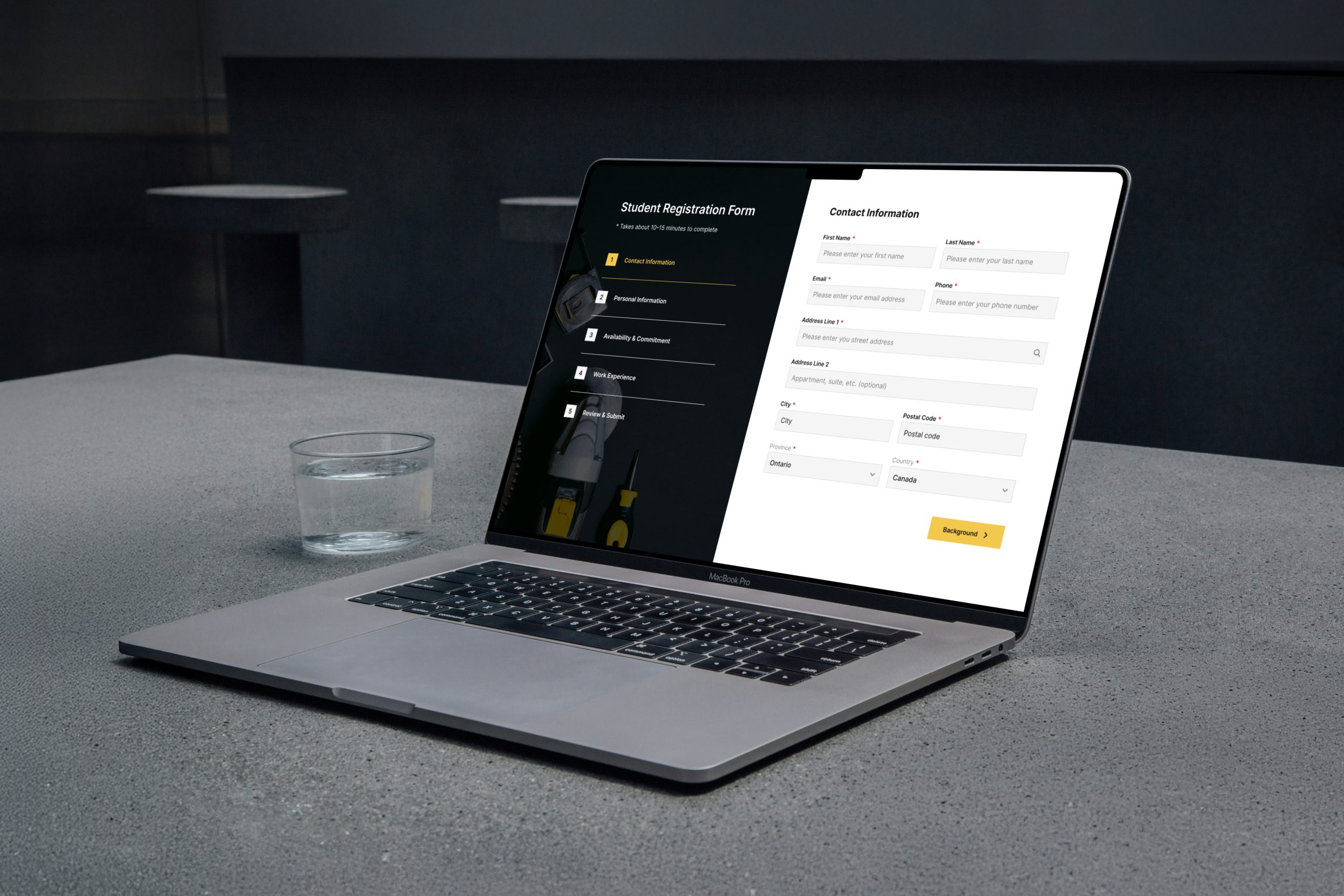
Instead of having the students fill out a basic form, then waiting for an admin to review that submission and craft an email to send out to the student with next steps and more forms to fill, we designed a multistep form that they could fill in one 10-15mins session.

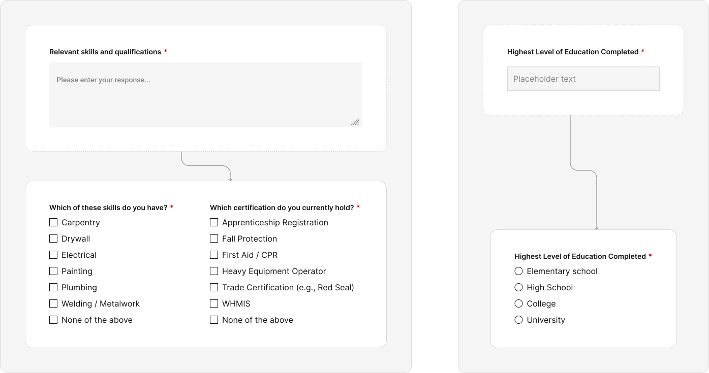
We also replaced the open-ended questions (which were not only hard for students to answer, but also caused a huge hassle for admins during application processing), we gave them a structured form with predefined response options.

Contact information form

Students can now complete their applications in one session

Instead of having the students fill out a basic form, then waiting for an admin to review that submission and craft an email to send out to the student with next steps and more forms to fill, we designed a multistep form that they could fill in one 10-15mins session.

We also replaced the open-ended questions (which were not only hard for students to answer, but also caused a huge hassle for admins during application processing), we gave them a structured form with predefined response options.

Metric Before After Impact analysis
Application completion time 45–60 minutes across multiple days 7–15 minutes in one session About 80% reduction: single-session completion reduces friction
Weekly student follow-ups 200+ emails <10 emails >95% reduction: immediate feedback about application submission improves trust
Admin team size 10–15 people 1–2 people 85–87% fewer staff needed, lowering operational cost
Time per application Days–weeks 2–5 minutes ~95% faster, backlog considerably reduced
Submission abandonment / spam High 99% legitimate submissions Significant increase in lead quality, near-zero spam
Data consolidation Multiple platforms, fragmented Centralized dashboard 100% of data centralized, easier decision-making
Weekly application volume <100 500+ 5× increase in completed applications
Perceived fairness & professionalism Moderate High Students trust process more, this reduces anxiety and complaints
Operational cost & scalability High with limited scalability Lower cost, better scalability Enables program growth without increasing admin load

System Design & Workflow Simplification

STUDENT WORKFLOW
  • Student visits the website and lands on the registration page

  • Registration page includes program information and a multistep application form

  • Student completes the multistep form

The consolidated multi-step form:
  • Integrates eligibility criteria as structured logic, allowing eligibility to be evaluated programmatically upon submission

  • Reduces the number of steps in the application process and eliminates platform switching

  • Reduces cognitive load by grouping related information and breaking the form into manageable steps

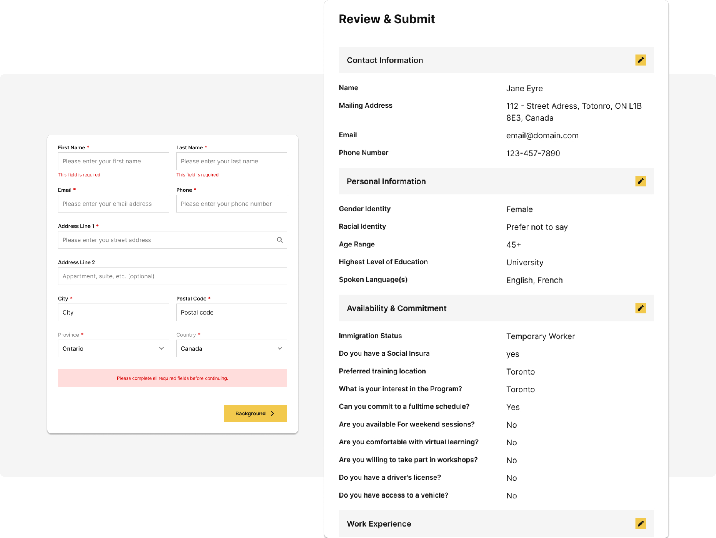
  • Provides clear validation and error states at every step

  • Discourages spam and low-effort submissions without using CAPTCHAs

  • Allows students to move back and correct mistakes at any point

  • Uses progress indicators to show completion status and reduce abandonment

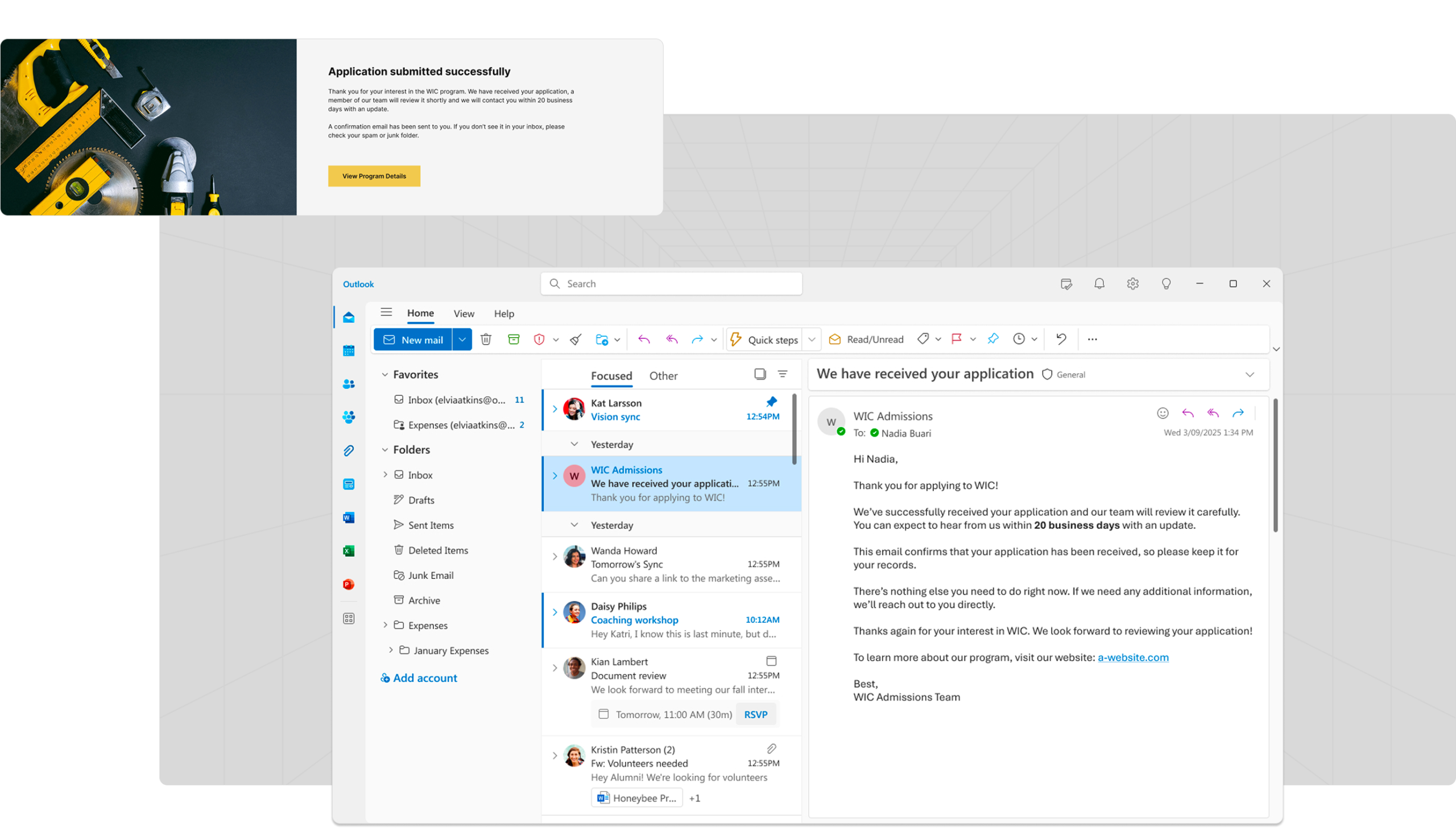
  • Upon submission, students see a clear confirmation screen stating that the application was successfully submitted

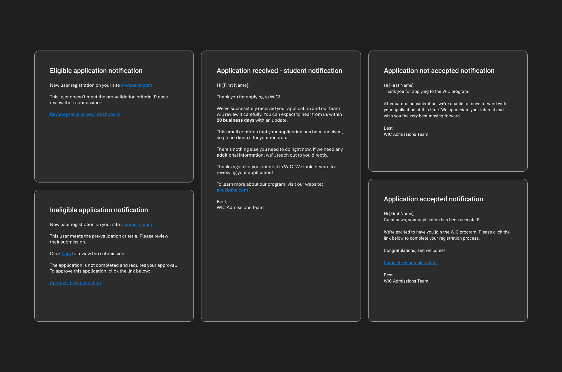
  • Students also receive an almost-instant receipt confirmation email reinforcing that their application has been received and will be reviewed

ADMIN WORKFLOW
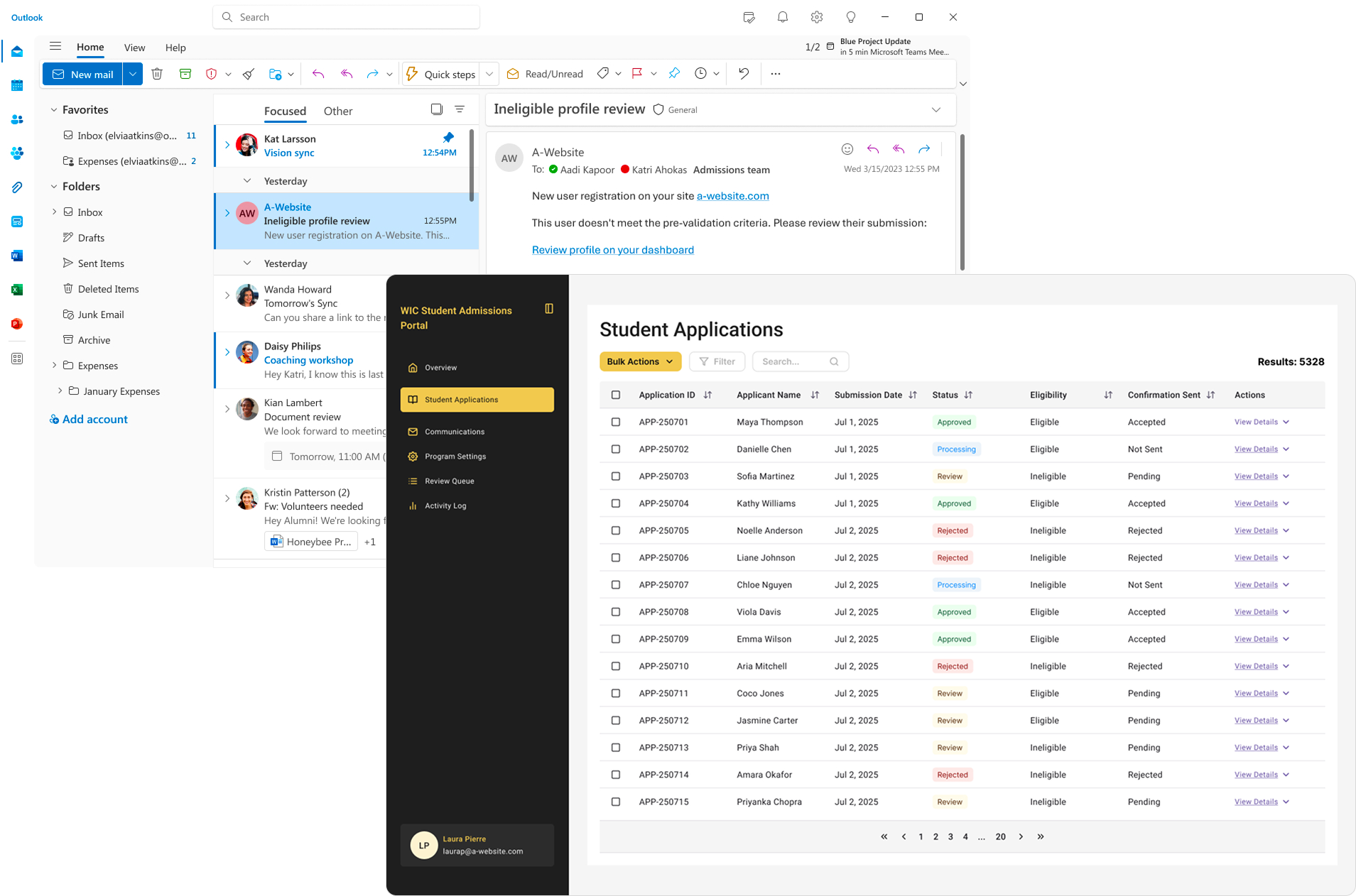
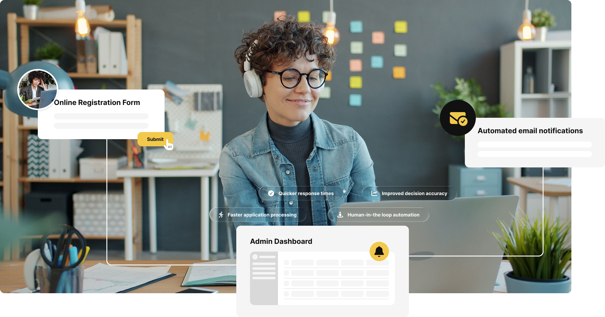
  • Admin receives a notification email when a new application is submitted

  • The email subject clearly indicates whether the submission meets eligibility criteria or not

  • The email body contains a structured summary of the application responses, providing immediate context without exposing sensitive data

  • For eligible submissions, the email includes a secure “approve submission” link

  • For ineligible submissions, the email includes a “view application” link that takes the admin to the dashboard for full review

Admin review and actions:
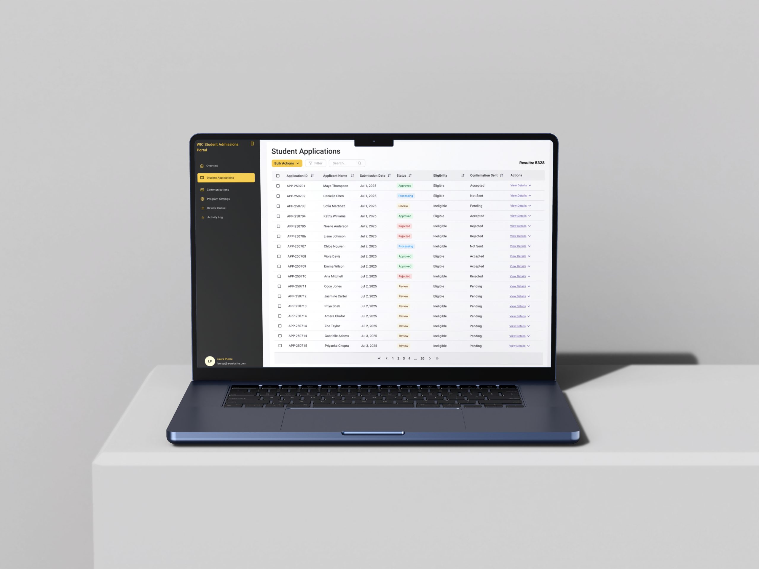
  • Admin can review the application details in the dashboard when needed

  • Admin can approve or reject the submission using simple, clearly defined actions

  • All actions require verification to prevent unauthorized access

  • Admin decisions trigger personalized, templated emails to students

  • Response timing is intentionally delayed to reinforce human review and avoid automated signaling

INTENTIONAL HUMAN-IN-THE-LOOP AUTOMATION

While full automation was possible, a human review step was intentionally preserved to:

  • Avoid impersonal, immediate rejections so that students feel their applications are fairly considered. This reduces trust erosion and emotional distress, since the applicants invest a significant amount of time and effort in their applications

  • Give admins control and allow discretionary exceptions for edge cases that the algorithm would otherwise exclude

  • Prevent students from submitting multiple applications in an attempt to “beat the system” once they realize the decisions are automated

Safeguards & Trust Decisions

No instant acceptance or rejection: Responses are intentionally delayed to avoid signaling automation and to reinforce trust in the fairness of the program.

Human review for all decisions: Admins have to review every application, especially those flagged as ineligible, before a final decision is made and communicated with the candidate.

Extra review step for rejections: Ineligible profiles require admins to view the full application in the dashboard before making a decision. Admins can use their discretion to make an exception for an ineligible candidate.

Limited data exposure in emails: Admin emails include a structured summary instead of full application data to protect applicant privacy.

Secure admin actions: Approval and review links require verification to prevent unauthorized access.

Multi-step form with validation: Reduces spam, prevents incomplete submissions, and improves data quality without using CAPTCHAs.

Clear confirmation and messaging: Students receive immediate confirmation that their application was submitted and will be reviewed. In case of errors, they get clear, unambiguous error messages pinpointing the exact issues that need to be fixed.

Centralized data with regular backups: Reduces risk of data loss while improving consistency and manageability.

Branding consistency across pages and emails: Reinforces legitimacy and trust, especially at the moment of submission.

Admin training and support: Ensures adoption, correct usage, and confidence in the new system.

Trade-Offs and Design Choices

Form length vs cognitive load: Multi-step was chosen over a single long page or a short “basic info + link to full eligibility form” approach. The long page was overwhelming for users, while the short form added an extra unnecessary step. The multi-step approach balanced cognitive load and workflow efficiency.

CAPTCHAs vs user experience: CAPTCHAs are effective for spam prevention, but prior feedback from other forms showed users found them frustrating. In this project, spam was managed through the multi-step form combined with validation and logic, avoiding CAPTCHAs entirely.

Response timing – speed vs trust: A minimum of two business days and a maximum of ten business days was chosen for responses. Instant acceptance or rejection would compromise human trust, while too much delay would frustrate applicants. This timing ensures automation for efficiency while preserving the perception of fair review.

Admin emails – convenience vs data privacy: Emails were structured to give admins an at-a-glance context of the submission and show eligibility based on predefined criteria. Quick-action links allowed one-click approval or rejection, with authentication added for security. Only a summary of the application (vs the full application – which would have been more convenient) was sent to protect applicant privacy.

Extra step for profile rejections – convenience vs risk: Eligible submissions can be approved with one click via the notification email. Ineligible profiles require admins to click “view application” and review the full application on the dashboard before making a decision. This accounts for the higher emotional and operational risk of rejections.

Eligibility logic – simplicity vs fidelity: Eligibility rules were simplified for implementation as if-else logic without compromising integrity. This required limiting free-form input while preserving the essence of the application criteria.

Results

FOR STUDENTS

67–88% reduction in application completion time: Because there are now fewer steps, fewer redirects and clearer expectations, application completion time has dropped from 45–60 minutes across multiple days–weeks, and multiple platforms to 7–15 minutes in one session on a single platform.

95–99%+ reduction in application status inquiries (Reduced frustration and uncertainty): The number of “did you get my application” emails dropped from hundreds weekly to almost none as students receive immediate on-page and email confirmation.

Greater confidence in the legitimacy of the process and the organization: Students now feel more confident they are not at risk of scams, and they trust the organization more based on the streamlined, professional application experience.

Perceive fairness and professionalism, reinforcing trust: The subtle layer of automation allows the students to enjoy the faster application processing while maintaining trust in the organization’s fairness and human touch in reviewing their applications.

FOR ADMINS

The system was designed so admins could make fast, confident decisions without second-guessing data quality or system behavior.

Dramatically reduced manual work and operational cost: A task that previously required a team of over 10 people now requires 2 people (with one person in the lead and the other in a supporting role).

96.7–98.7% increase in application processing efficiency and reduced backlog: Admins previously took days to weeks per application (scanning their emails for the submissions from the basic form, sending out the eligibility form, manually analysing the submission against admission criteria, writing an email to let the candidate know the outcome, etc). Now, this process takes 2-5minutes.

Lower risk of manual error: The added layer of automation minimizes mistakes, such as accidentally rejecting an eligible student or accepting an ineligible one. Student submissions no longer get lost in multi-step workflows because all steps are consolidated on one platform.

Reduced spam and abandonment: Submission volume exceeded 1,500 applications within three weeks of rolling out the update, compared to the fewer than 100 per week previously. Additionally, approximately 99% of submissions are legitimate, strong leads.

Centralized, organized data for better decision-making: Admins can now access all student data from a single dashboard, eliminating the need to consolidate mismatched and incomplete data from multiple platforms.

Consistent communication without copy/paste errors: Now that emails are generated from templates, it is easier to ensure consistent messaging while maintaining personalized communication. Managing email templates is also so much easier and straightforward.

FOR THE PROGRAM

Improved scalability: The new system makes it easier to handle more applications without overly increasing admin workload.

Lower operational risk: Centralized data, structured workflows, and automated checks reduce the likelihood of errors and lost applications.

Lower operational cost: With fewer admins and fewer tools required for the same workload, the program now operates more efficiently.

Enhanced data quality and insights: Centralized, organized data allows program managers to analyse trends, measure interest and make informed decisions more easily.

Stronger perception of professionalism and fairness: Applicants have a better perception of the program and trust they are being fairly evaluated. This reinforces brand reputation and applicant satisfaction.

WHAT CAME NEXT

This foundation enabled the creation of an admin dashboard for managing students, courses, and access to program content online. Accepted students received login credentials as part of their acceptance flow, extending the system beyond admissions into ongoing program management.

Risks & Mitigations

Risk Details Mitigation
Single system dependency Relying on one centralized form and database creates a potential single point of failure Daily backups, continuous monitoring and testing, immediate alerts to developers if the form or database fails.
Data loss or compromise If the database is lost or breached, all submissions could be affected Properly secure the database, daily backups, strict access controls, and minimal sensitive information sent via email
Admin adoption risk Admins may struggle to adapt to the new system or resist the changes, which will make the whole redesign mute Provide clear training, documentation, and a sandbox environment for practice before live rollout
User abandonment or frustration Multi-step forms or validation errors could discourage students from completing applications. Include progress indicators, clear validation messages at each step, and the ability to go back and edit previous steps to reduce cognitive load
Trust erosion through automation Fully automated rejections could feel impersonal and reduce confidence in the program Preserve a human review step, prescribe delaying responses by 2–10 business days, and allow admins to override the system in edge cases.

Reflection

  • This project reinforced an important principle: automation should reduce friction, not remove humanity. Trust is primordial for systems like this and humans must remain in decision loops for sensitive processes
  • Simple, clear, and structured data makes scaling possible without increasing staff workload
  • Iterative testing in sandbox environments uncovers subtle usability and technical issues
  • Strategic use of multi-step design can greatly increase quality of submissions, and reduce abandonment
  • By designing the system around both operational efficiency and emotional trust, the solution improved outcomes for students, administrators, and the organization without sacrificing empathy.

Future Improvements

  • Add a final review summary step for students before submission
  • Allow edits prior to final confirmation
  • Enable save-and-continue functionality
  • Support multiple programs with different eligibility rules
  • Adjust response rules for increased submission volumes
Registration system mockup
Privacy Settings
We use cookies to enhance your experience while using our website. If you are using our Services via a browser you can restrict, block or remove cookies through your web browser settings. We also use content and scripts from third parties that may use tracking technologies. You can selectively provide your consent below to allow such third party embeds. For complete information about the cookies we use, data we collect and how we process them, please check our Privacy Policy
Youtube
Consent to display content from - Youtube
Vimeo
Consent to display content from - Vimeo
Google Maps
Consent to display content from - Google