Iconography in UI/UX Design
Icons play an important role in shaping our digital interactions, influencing how we navigate interfaces and interpret information. They serve as visual cues that bridge the gap between users and technology, enhancing usability and user experience. Understanding the principles and evolution of iconography is essential for designers seeking to create intuitive and engaging interfaces.
This article explores the significance of iconography in UI/UX design, delving into its historical roots, design principles, best practices, and future trends.
1. Introduction
Definitions
Icons are symbols that represent an object, action, or idea.
Iconography in the context of UI/UX design refers to the use of icons to communicate a message within a digital interface. These icons are often used to represent functions, features, or content in a way that is easy to understand and intuitive for users. Iconography helps to improve usability, accessibility, and overall user experience
Importance of iconography in user interfaces
The importance of icons in user interfaces extends far beyond visual embellishment. By understanding the importance of iconography and incorporating it thoughtfully into UI design, designers can create interfaces that are not only functional and intuitive but also visually appealing and memorable. Here are some key reasons why iconography is crucial:
a. Visual communication:
Icons are universal language elements that transcend linguistic barriers, making them a powerful tool for communicating ideas and actions globally. Provided they are well-designed, they can convey complex concepts at a glance, across multiple languages in a simple intuitive manner.
b. Enhanced usability:
Icons are typically large enough to be easily touched in a finger-operated UI or clicked with a mouse cursor, thus they can improve the usability of an interface by providing users with quick access to common functions or features. Icons also provide visual cues that help reduce the cognitive load on users, allowing them to interact with interfaces more intuitively.
c. Recognition and recall:
Icons typically resemble familiar real-world objects, for example, a magnifying glass icon commonly signifies search functionality, a trash can icon indicates the ability to delete items, an envelop icon represents mail, etc. When users encounter these icons, they can quickly identify their meaning and recall their associated icons. This speeds up task completion and improves overall efficiency.
d. Space efficiency:
Icons can convey information in a compact form, allowing designers to save space and avoid clutter in the user interface. This is particularly helpful in mobile and responsive design where the screen real estate is limited and every pixel counts.
e. Brand identity:
Icons contribute to brand identity by serving as visual representations of a brand’s personality and values. Consistent use of icons that align with a brand’s visual language helps reinforce brand recognition and build loyalty among users.
f. Aesthetic appeal:
Well-designed icons can enhance the visual appeal of an interface, making it more engaging, balanced, harmonious, and visually pleasing. This can contribute to a positive overall user experience.
2. Historical Overview of Iconography
The historical overview of iconography in UI/UX design traces back to the early days of computing, with significant developments shaping the evolution of icons into the ubiquitous elements we see today.
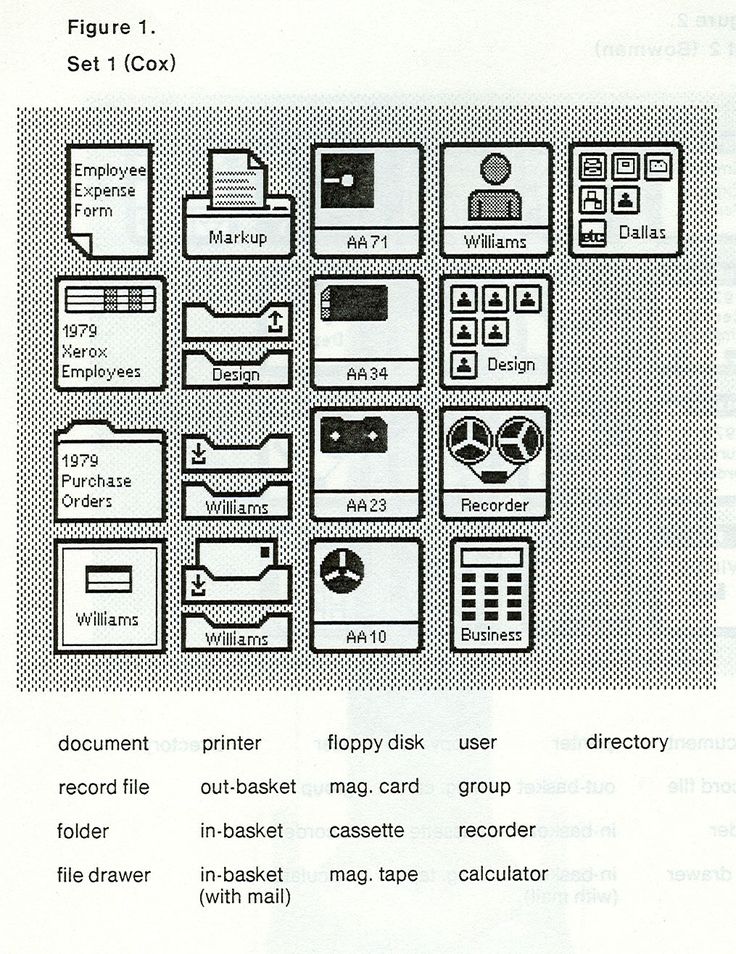
Early Computing: The concept of graphical user interfaces (GUIs) began to emerge in the 1960s and 1970s, notably with the work done at Xerox PARC (Palo Alto Research Center). Xerox PARC developed the first GUI system, which included icons to represent applications and functions, such as the iconic desktop metaphor.
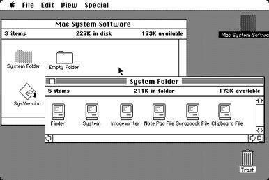
Macintosh and Windows: The introduction of the Apple Macintosh in 1984 and Microsoft Windows in 1985 brought icons to a wider audience. These operating systems used icons extensively to represent files, folders, applications, and system functions, making computing more intuitive and accessible to users.
Microsoft Windows and Icon Design Standards: Microsoft Windows, released in 1985, adopted a similar GUI paradigm to the Macintosh, with icons playing a central role in navigation and interaction. As the use of icons became more prevalent, standards for icon design began to emerge. The Microsoft Windows User Experience guidelines, first published in 1995, provided detailed recommendations for icon design, including size, color depth, and visual style.
Evolution of Visual Styles: Over the years, icon design has evolved alongside trends in graphic design. From the skeuomorphic icons that mimicked real-world objects to the flat and minimalist icons popularized by modern design trends, icons have adapted to reflect changing design aesthetics and user preferences.
Icon Libraries and Tools: The development of icon libraries and design tools has also played a significant role in the evolution of iconography. Libraries like Font Awesome and Material Design Icons provide designers with a vast array of ready-to-use icons, while tools like Adobe Illustrator, Macromedia FreeHand (later acquired by Adobe), and later, Sketch and Figma enable designers to create custom icons easily.
Current Trends: Today, icons are omnipresent in digital interfaces, from desktop applications to mobile apps and websites. Iconography continues to evolve, with trends leaning toward simplicity, clarity, and scalability. Icons are not only used in traditional computing interfaces but also in mobile apps, websites, and other digital environments, highlighting their enduring importance in UI/UX design.
The future of iconography may see further integration with emerging technologies such as augmented reality (AR) and virtual reality (VR), as well as advancements in dynamic and interactive icon design.
3. Principles of Icon Design
To create effective icons, designers must adhere to key principles that govern their design and use. These principles ensure that icons are not only visually appealing but also clear, meaningful, and consistent with user expectations. This section explores the fundamental principles of icon design and provides real-life examples to illustrate these concepts.
a. Simplicity and clarity
Simplicity and clarity are foundational principles of icon design. Icons should embody the concept of “less is more”. Icons should convey their meaning instantly and without ambiguity, without the need for explanation or interpretation. Avoiding unnecessary complexity helps ensure that icons are easily recognizable and understandable at a glance. Using basic shapes, and minimal details in icons can help achieve simplicity and reduce cognitive load on users.
For example, the “home” icon, commonly represented by a simple house shape, is universally understood as a symbol for returning to the homepage or main screen, the envelope icon commonly represents email functionality in interfaces like Gmail and Outlook, instantly communicating the action of composing or accessing emails
b. Consistency and coherence
Consistent use of color, style, and size helps users quickly identify and associate icons with specific actions or functions. This can be achieved by establishing a set of design guidelines for icons, including rules for color usage, shape consistency, and visual hierarchy.
For example, in the iOS interface, app icons follow a consistent rounded-square shape with consistent use of colors and visual elements, creating a unified look and feel.
c. Meaningfulness and relevance
It is important to ensure that icons have clear and intuitive meanings that align with user expectations and are relevant to the context in which they are being used. This reduces the need for labels and helps users understand the purpose of the different interface elements, thus improving visual appeal, accessibility, usability, and overall user experience. To achieve this, designers should use familiar symbols and metaphors that users can easily recognize.
For example, the “heart” icon is commonly used to represent liking or favoriting content, leveraging the universal association of the heart shape with positive emotions.
d. Scalability and adaptability
Icons must remain effective and meaningful across different interface designs and scenarios. Designers should consider how icons will be utilized across various devices and screen sizes to ensure adaptability. Maintaining clear, well-defined shapes and proportions facilitates scalability and adaptability. This can be achieved by using simple, well-defined shapes and avoiding intricate details that may become blurred or distorted at smaller sizes. Icons should also be exported in vector fomats and tested at different sizes to ensure readability.
e. Conservation of meaning
Adhering to established iconography standards leverages users’ existing knowledge and expectations. Utilizing commonly understood symbols and metaphors ensures icons maintain their intended meaning.
For example, the “play” icon, a right-facing triangle, is a standard symbol for playing media. Using it to perform an action like “upload” may be very confusing for users.
f. Accessibility
Icons should be perceivable and understandable to users with diverse abilities. Incorporating sufficient color contrast and employing clear, well-defined shapes aid in ensuring accessibility. Icons should be designed to accommodate users with visual impairments, such as utilizing distinct shapes and proportions.
g. Feedback
Icons play a crucial role in providing users with feedback on the outcome of their actions. Clear, distinct visual cues communicate the result of an action effectively. For instance, the “checkmark” icon signifies a successful action, while a warning icon indicates an error or problem encountered. These visual cues provide users with immediate feedback, enhancing the overall user experience.
h. Distinctiveness
Icons should be distinctive to avoid confusion with other icons or visual elements within the interface. Using unique shapes, colors, or styles can help make icons easily distinguishable.
i. Balance and harmony
Achieving visual balance in icon design entails careful consideration of elements such as shape, size, and negative space. Icons should maintain a harmonious composition without appearing overly cluttered or weighted towards one side. They should also seamlessly integrate with other elements of the user interface or brand.
A good example to look at is the Material Design framework, where icons adhere to a unified visual style across Google’s ecosystem of apps and platforms.
j. Cultural Sensitivity
Icons should be culturally sensitive and recognizable, considering the diverse interpretations of symbols across different cultures. Designers must be mindful of symbols that may hold different meanings or connotations in various cultural contexts to avoid unintentionally causing confusion or offense.
For example, mailboxes look very different in various countries whereas envelopes look the same, therefore an envelope is a more international icon for an email program than a mailbox.
k. Innovation:
While adhering to established design principles is important, designers should also explore innovative approaches to icon design. Introducing new visual metaphors or styles can provide users with fresh and engaging experiences.
4. Types of Icons in UI/UX Design
In UI/UX design, icons can be categorized into three main types based on their function and purpose: Functional Icons, Decorative Icons, and System Icons. Each type plays a distinct role in enhancing the usability, aesthetics, and overall user experience of interfaces. Understanding these types of icons and their applications is crucial for designers looking to create intuitive and visually appealing interfaces. This section explores each type in detail, highlighting their significance in UI/UX design.
a. Functional icons
Functional icons are fundamental components of UI/UX design, serving as visual representations of specific actions, commands, or navigation elements within an interface. These icons are designed to be immediately recognizable and intuitive, facilitating user interaction and task completion.
- Navigation Icons: they help users navigate within an interface, between different sections or pages e.g. arrows (back, forward), home icon (return to the main screen), and menu icons (access additional options).
- Action Icons: these represent common actions that users can perform within an interface, such as delete, edit, add, save, or share.
- Control Icons: they are used for tasks like controlling media playback (play, pause, stop, rewind, fast forward), adjusting volume, toggling settings (mute, fullscreen), or performing other interactive tasks.
b. Decorative icons (e.g., illustrations, aesthetic elements)
Decorative icons serve a different purpose than functional icons, they contribute to the visual appeal and aesthetic richness of UI/UX design, adding more personality and visual interest. They enhance the overall look and feel of an interface and contribute to branding and identity.
- Illustrative Icons: these depict concepts, objects, or ideas in a stylized or artistic manner, enhancing visual storytelling and engagement.
- Aesthetic Elements: decorative icons can include aesthetic elements such as flourishes, patterns, or ornamental designs. They can be used to fill empty spaces, create visual balance, add visual interest and depth to interfaces.
c. System icons (e.g., status indicators, notifications)
System icons convey information, status updates, or notifications to users, providing feedback, guidance, and context within interfaces. These icons are standardized across different platforms to ensure consistency and universal understanding.
- Status Indicators: these are usually used to indicate the status of processes or tasks, such as loading indicators, checkmarks (task completed successfully), or warning icons (errors or issues). They provide users with feedback about the progress or outcome of their actions, helping them understand the current state of the interface.
- Notification icons: they alert users to new messages, updates, or events that require their attention, such as bell icons (notifications) or envelope icons (new messages).
- Navigation Elements: system icons are also used for system-level navigation, such as back arrows (navigate to the previous screen) or hamburger menu icons (access additional options).
5. Best Practices in Iconography
To ensure icons are effective and impactful, designers must adhere to best practices that govern their creation and implementation.
a. Grid systems and icon alignment
Grid systems provide a framework for consistent icon alignment, ensuring icons are visually balanced and harmonious within an interface. By aligning icons to a grid, designers create a sense of order and organization, enhancing the overall visual appeal and usability of the interface. Key considerations include:
- Consistency: Use a consistent grid system throughout the interface to maintain alignment across icons.
- Alignment: Aligning icons to the same baseline or vertical axis creates a clean and organized appearance and enhances visual coherence.
- Spacing: Ensure proper spacing between icons to prevent overcrowding and maintain clarity.
- Proportions: Maintain consistent proportions and alignment within icon sets to create a cohesive visual language.
b. Color, size, and shape considerations
Color, size, and shape are essential aspects of icon design that impact usability and aesthetics. Designers must consider these factors carefully to ensure icons are visually appealing and functional. Key considerations include:
- Color Contrast: Ensure sufficient color contrast between icons and background elements to enhance visibility, especially for users with visual impairments.
- Size Consistency: Maintain consistent icon sizes throughout the interface to create harmony and facilitate recognition.
- Shape Clarity: Use clear, distinct shapes that are easily recognizable and convey meaning without ambiguity. Avoid overly complex or intricate shapes that may be difficult to discern at smaller sizes.
c. Accessibility and inclusivity in icon design
Accessibility and inclusivity are paramount in icon design to ensure all users can interact with interfaces effectively. Designers should consider diverse user needs and design icons that are accessible to everyone.
- Alternative Text: Provide alternative text or labels for icons to ensure they are accessible to users who rely on screen readers or have visual impairments.
- Color Blindness: Use color schemes that are accessible to users with color blindness, ensuring icons remain distinguishable. Also, avoid relying solely on color to convey meaning in icons, as color-blind users may have difficulty distinguishing certain hues. Utilize additional visual cues, such as shape or texture, to enhance clarity.
- Universal Symbols: Use universally understood symbols and metaphors to ensure icons are inclusive and accessible across cultures.
d. Icon sets and libraries for efficient design
Utilizing icon sets and libraries can streamline the design process and ensure consistency across interfaces. Designers can leverage existing icon sets or create custom libraries to maintain a cohesive visual language.
- Consistency: Choose icon sets with a consistent visual style to maintain coherence throughout the interface. Consistency in style enhances usability and reinforces brand identity.
- Pre-designed Icons: Save time and effort by reusing icons from existing libraries rather than creating new ones from scratch.
- Customization: Customize icons from libraries to suit specific design requirements while maintaining overall consistency.
There are several popular icon sets and libraries available for designers to use in their projects. Here are some well-known icon sets and libraries:
- Font Awesome: Font Awesome is a popular icon set that offers a vast collection of scalable vector icons that can be customized with CSS. It is widely used in web development due to its ease of use and versatility.
- Material Icons: Material Icons is a collection of icons designed by Google in the Material Design style. These icons are optimized for use in digital interfaces and are available in various formats, including SVG and PNG.
- Ionicons: Ionicons is a premium icon set designed for use with the Ionic Framework, but it can also be used in other projects. It features a wide range of icons with a clean and modern design.
- Feather Icons: Feather Icons is a lightweight icon set that offers simple and clean icons for use in web and mobile interfaces. It is highly customizable and easy to use.
- FontAwesome: FontAwesome is a widely used icon set that offers a comprehensive collection of icons for various purposes. It is available in different versions, including the free version and the premium Pro version.
- Simple Icons: Simple Icons is a collection of icons for popular brands and services. It provides icons for social media platforms, software, and other brands, making it easy to add branding elements to interfaces.
- Streamline Icons: Streamline Icons is a premium icon set that offers a large collection of icons designed for use in web and mobile interfaces. It features a modern and minimalist design that is suitable for various design styles.
- Bootstrap Icons: Bootstrap Icons is a free icon set designed for use with the Bootstrap framework. It includes over 1,400 icons in SVG format, making them easy to customize and use in web projects
6. Case Studies
Successful iconography in popular apps/websites
a. Apple’s iOS Icons:
Apple’s iOS icons are a prime example of successful iconography.
- Design Philosophy: Apple’s iOS icons are designed with a focus on simplicity, clarity, and consistency. They use familiar metaphors and visual cues to convey functionality, making them intuitive for users.
- Consistent Visual Language: Apple maintains a consistent visual language across its icons, using similar shapes, colors, and styles. This consistency helps users easily recognize and remember the icons.
- Adaptability: iOS icons are designed to be adaptable, scaling smoothly to different screen sizes and resolutions. This ensures that the icons remain clear and legible on all devices.
- User Feedback: Apple regularly solicits feedback from users to improve its icons. This iterative approach allows Apple to refine its iconography based on user preferences and usability testing.
b. Google’s Material Design Icons:
Google’s Material Design icons are another great example of effective iconography. They are designed with consistent shapes, colors, and sizes, creating a cohesive visual language across Google’s products and services.
- Consistent Design: Google’s Material Design icons follow a set of design principles that emphasize clarity, hierarchy, and consistency. This ensures that the icons are easily recognizable and usable across different products and platforms.
- Adaptive Iconography: Material Design icons are designed to be adaptive, meaning they can change appearance based on context or user interaction. This adds depth and interactivity to the icons, enhancing the overall user experience.
- Accessibility: Google places a strong emphasis on accessibility in its icon design, ensuring that icons are perceivable and understandable to users with diverse abilities.
- Global Recognition: Google’s Material Design icons have achieved global recognition and are widely used in various applications and websites. This widespread adoption is a testament to the effectiveness of the iconography.
c. Facebook’s Like Button:
While not a traditional icon, Facebook’s Like button has become a ubiquitous symbol across the web. Its simple design and universal meaning have made it instantly recognizable and synonymous with expressing approval or appreciation.
- Icon Evolution: The Facebook Like button has evolved over time, starting as a simple thumbs-up icon and later incorporating a more detailed design. Despite these changes, the core meaning of the icon has remained consistent.
- Universal Symbolism: The Like button has become a universal symbol for expressing approval or appreciation on social media. Its simple design and universal meaning have contributed to its success.
- User Engagement: The Like button has been instrumental in driving user engagement on Facebook, allowing users to easily interact with posts and express their feelings without using words.
- Brand Recognition: The Like button has become synonymous with Facebook’s brand identity, reinforcing the platform’s image as a social networking site.
B. Analysis of icon design failures and their impact on user experience
Snapchat’s Confusing Icons:
Snapchat has faced criticism for its use of ambiguous icons, such as the ghost icon for the app’s main menu. Users have struggled to understand the meaning of certain icons, leading to frustration and confusion.
- User Feedback: Snapchat has received feedback from users regarding the ambiguity of its icons. The company has made efforts to improve the clarity of its iconography based on this feedback.
- Impact on User Experience: Confusing icons can negatively impact the user experience by making it difficult for users to navigate the app or understand its functionality. This can lead to frustration and reduced user engagement.
- Improvement Efforts: Snapchat has made efforts to improve the clarity of its icons, to make them more distinct and recognizable.
Microsoft’s Cluttered Toolbar Icons:
In the past, Microsoft has been criticized for its use of cluttered and visually complex toolbar icons in applications like Microsoft Office. These icons can be overwhelming and make it difficult for users to quickly identify the desired action.
- User Interface Overhaul: Microsoft has undergone several user interface overhauls to address the issue of cluttered icons. These efforts have focused on simplifying the design and improving the usability of the icons.
- Impact on Productivity: Complex icons can hinder productivity by making it difficult for users to find and use the desired features. This can lead to frustration and reduced efficiency.
- Design Iterations: Microsoft has iterated on its icon design over the years, incorporating user feedback and usability testing to improve the clarity and usability of its icons.
7. Future Trends in Iconography
As technology continues to evolve and user interfaces become more sophisticated, the role of iconography in shaping user experiences becomes increasingly significant. From dynamic and interactive icons to the rise of personalized and adaptive designs, the future of iconography promises to revolutionize how users interact with digital interfaces. Here are some interesting trends to watch:
- Dynamic and Interactive Icons: Icons are becoming more dynamic, responding to user interactions and providing real-time feedback. For example, on many modern websites and apps, icons change color or shape when hovered over or clicked on, offering users immediate visual feedback on their actions.
- 3D and Depth Effects: With advancements in display technology, icons are adopting 3D and depth effects to create a more immersive user experience. This trend includes icons with realistic lighting, shadows, and textures, creating a more tactile and lifelike appearance.
- Motion and Animation: Motion and animation are increasingly used to bring icons to life, making interfaces more engaging and intuitive. Apps like TikTok use animated icons to guide users through the app’s features, creating a seamless and enjoyable user experience.
- Personalized Icons: Icons are becoming more personalized, adapting to individual user preferences and behavior. For instance, on music streaming platforms like Spotify, icons may change based on a user’s listening history or mood, providing a more tailored and relevant experience.
- Augmented Reality (AR) Icons: In AR interfaces, icons can interact with the physical environment, providing users with contextually relevant information. For example, in navigation apps like Google Maps AR, icons overlay directional arrows onto real-world scenes, guiding users to their destinations.
- Minimalistic and Abstract Designs: While some trends may lean towards more complexity, there is also a growing interest in minimalistic and abstract icon designs. These designs focus on simplicity and clarity, reducing icons to their essential elements. Apps like Google Keep feature simple, geometric icons that convey information clearly and concisely, enhancing usability and clarity.
- Voice and Gesture Control Icons: With the rise of voice and gesture control interfaces, icons are being designed to support these interaction methods. Smart home devices like the Amazon Echo feature voice-controlled icons that respond to spoken commands, providing users with hands-free control.
- Emotive and Expressive Icons: Icons are becoming more emotive and expressive, conveying a wider range of emotions and actions. Social media platforms like Facebook use animated emojis as icons, allowing users to express themselves more effectively and adding a human touch to interactions.
- Adaptive and Responsive Icons: Icons are being designed to adapt to different contexts, such as screen size or user preferences. This trend ensures that icons remain clear and usable across various devices and settings. Responsive websites like Google News feature icons that adjust their size and layout based on the user’s device, ensuring a consistent and user-friendly experience across platforms.
- Cross-platform and Universal Icons: With the need for consistency across platforms and devices, icons are increasingly designed to be cross-platform and universal, ensuring consistency across different interfaces and environments. Design systems like Material Design by Google provide a library of icons that can be seamlessly integrated into various platforms and applications, maintaining a cohesive visual identity across the ecosystem.
8. Conclusion
Iconography plays a crucial role in modern user interface design, serving as a visual language that communicates information, guides interactions, and enhances the overall user experience. As we have discussed in this article, successful iconography is characterized by simplicity, clarity, and consistency, allowing users to quickly understand and interact with interfaces across various devices and platforms.
The future of iconography is filled with exciting possibilities. Dynamic and interactive icons will provide users with more engaging and immersive experiences, while personalized icons will cater to individual preferences and behaviors. Augmented reality (AR) will bring icons into the physical world, and minimalistic designs will continue to emphasize simplicity and clarity.
Further Research
To further explore the evolving landscape of iconography in UI/UX design, some of my future research will focus on the following areas:
- The impact of emerging technologies, such as artificial intelligence and virtual reality, on icon design and user interaction.
- The role of cultural context in iconography and its influence on user perception and understanding.
- The development of new design principles and guidelines for creating accessible and inclusive icons for users with diverse abilities.
References
- Nielsen Norman Group. (n.d.). Icon Usability. https://www.nngroup.com/articles/icon-usability/
- Nielsen Norman Group, “The Myth of the Icon That Never Needed Text.” Available at: https://www.nngroup.com/articles/icons-as-part-of-a-great-user-experience/
- Ambrose, G., & Harris, P. (2011). The Fundamentals of Graphic Design. AVA Publishing.
- Cooper, A., Reimann, R., & Cronin, D. (2007). About Face 3: The Essentials of Interaction Design. Wiley.
- Tondreau, B. (2014). Designing Icons for the User Interface. Apress.
- Johnson, J. (2000). GUI Bloopers: Don’ts and Do’s for Software Developers and Web Designers. Morgan Kaufmann.
- Microsoft. (1995). Microsoft Windows User Experience: Official Guidelines for User Interface Developers and Designers. Microsoft Press.
- Apple Human Interface Guidelines, Icons and Images Overview. Available at: https://developer.apple.com/design/human-interface-guidelines/ios/icons-and-images/overview/
- Tondreau, B. (2014). Designing Icons for the User Interface. Apress.
- “A Brief History of User Interface Design.” Interaction Design Foundation, www.interaction-design.org/literature/article/a-brief-history-of-user-interface-design
- Icons8, “Icon Design Trends for 2022.” Available at: https://icons8.com/articles/icon-design-trends-for-2022/
- Creative Bloq, “Trends in Icon Design for 2022.” Available at: https://www.creativebloq.com/features/icon-design-trends
- Medium UX Collective, “The Next Generation of Icons: Trends in Icon Design.” Available at: https://uxdesign.cc/the-next-generation-of-icons-trends-in-icon-design-8ec28696e83a
- Adobe XD Ideas, “The Future of Iconography in User Interface Design.” Available at: https://www.adobe.com/creativecloud/xd/ideas/ui-ux-design/iconography-trends.html