POKU - SKETCH SOULDIER
The focus of this project was to craft an online platform for a talented sketch artist that not only showcased their diverse portfolio but also featured a specialized event calendar to spotlight upcoming events where their followers could find them.
The website gives visitors an insight into who the artist is and offers a unique blend of artistic expression coupled with a convenient overview of the artist’s scheduled appearances.
The Agile project methodology proved instrumental in the success of this project. Embracing an Agile approach facilitated a dynamic and iterative development process that allowed us to respond swiftly to evolving client needs.
MY ROLES
Project Manager
UI/UX Designer
Developer
DELIVERABLES
Fully functional and visually appealing sketch artist portfolio website.
Custom event calendar seamlessly integrated into the website.
User-friendly content management system for easy artist portfolio updates.
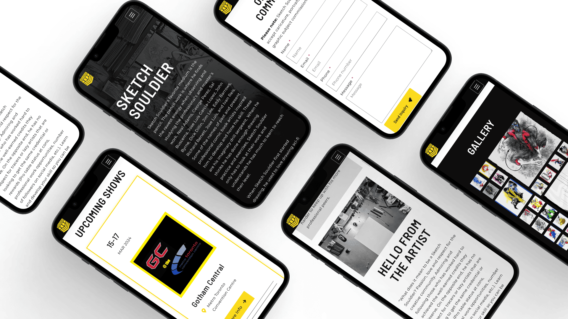
Responsive design to ensure optimal viewing experience across devices.
User guide to train the website owner on how to update their website.
TOOLS AND TECHNOLOGIES
Figma
Octopus
PhotoShop
WordPress
Elementor Pro
PHP
CSS
Google Analytics
User stories
These were derived from discussions with the client and regularly updated during project reviews.
| User Story | Proposed Solution |
| As an artist, I need a platform to showcase my art to visitors. | Create a visually engaging portfolio section on the website where the artist can display a diverse collection of their sketches, providing visitors with an immersive experience of their artistic talent. |
| As an artist, I need a platform where followers can easily find me. | Implement clear navigation and prominent social media integration to enable followers to easily locate and connect with the artist on various online platforms, fostering a broader and more engaged audience. |
| As an artist, I need a platform where visitors can get to know me. | Develop an “About Me” section that provides a personal and compelling narrative, offering insights into the artist’s background, inspirations, and artistic journey, fostering a deeper connection with visitors. |
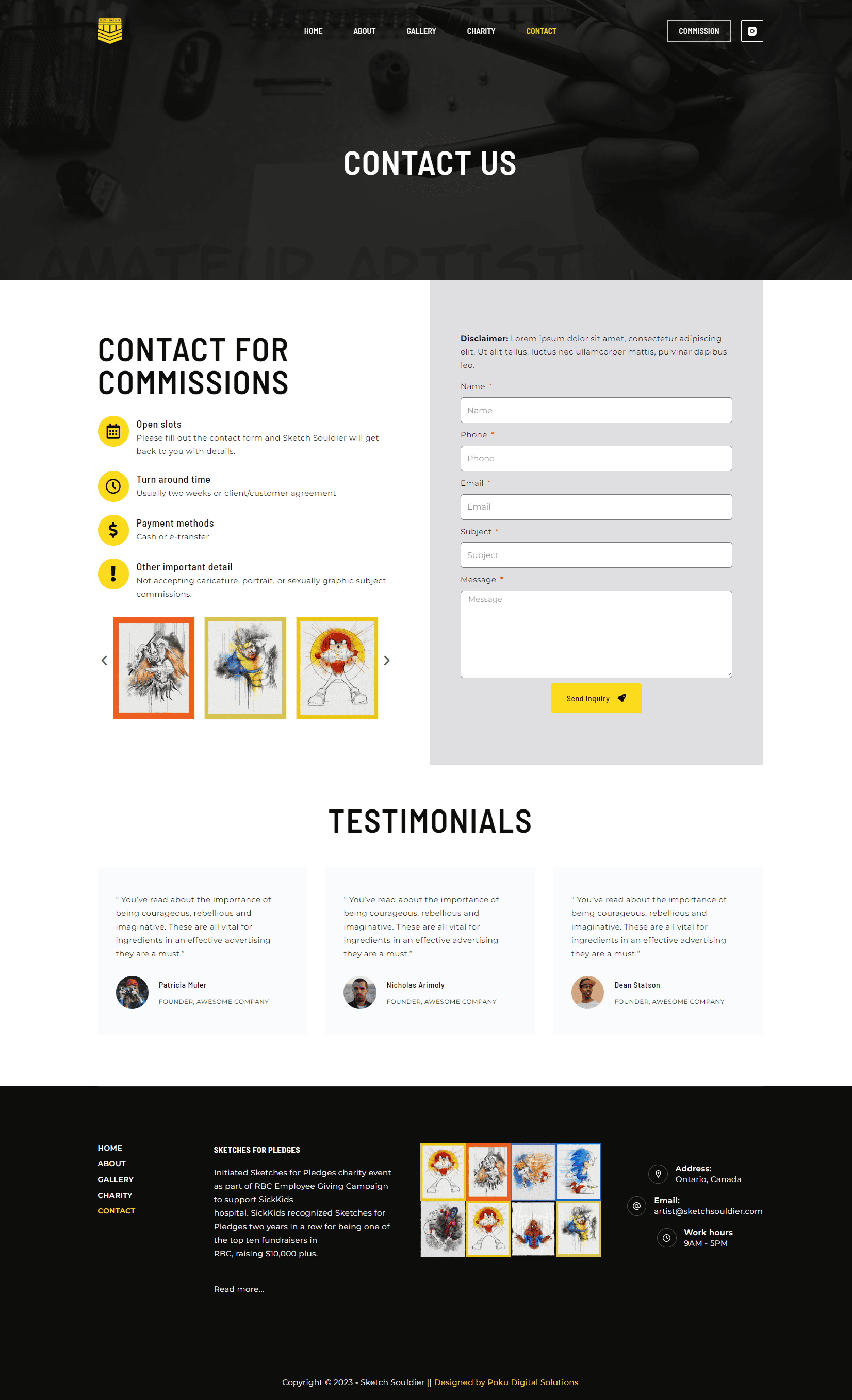
| As an artist, I need a platform where people can contact me for commissions. | Integrate a user-friendly contact form, allowing visitors to inquire about commissioning personalized sketches directly through the website, streamlining the commission request process. |
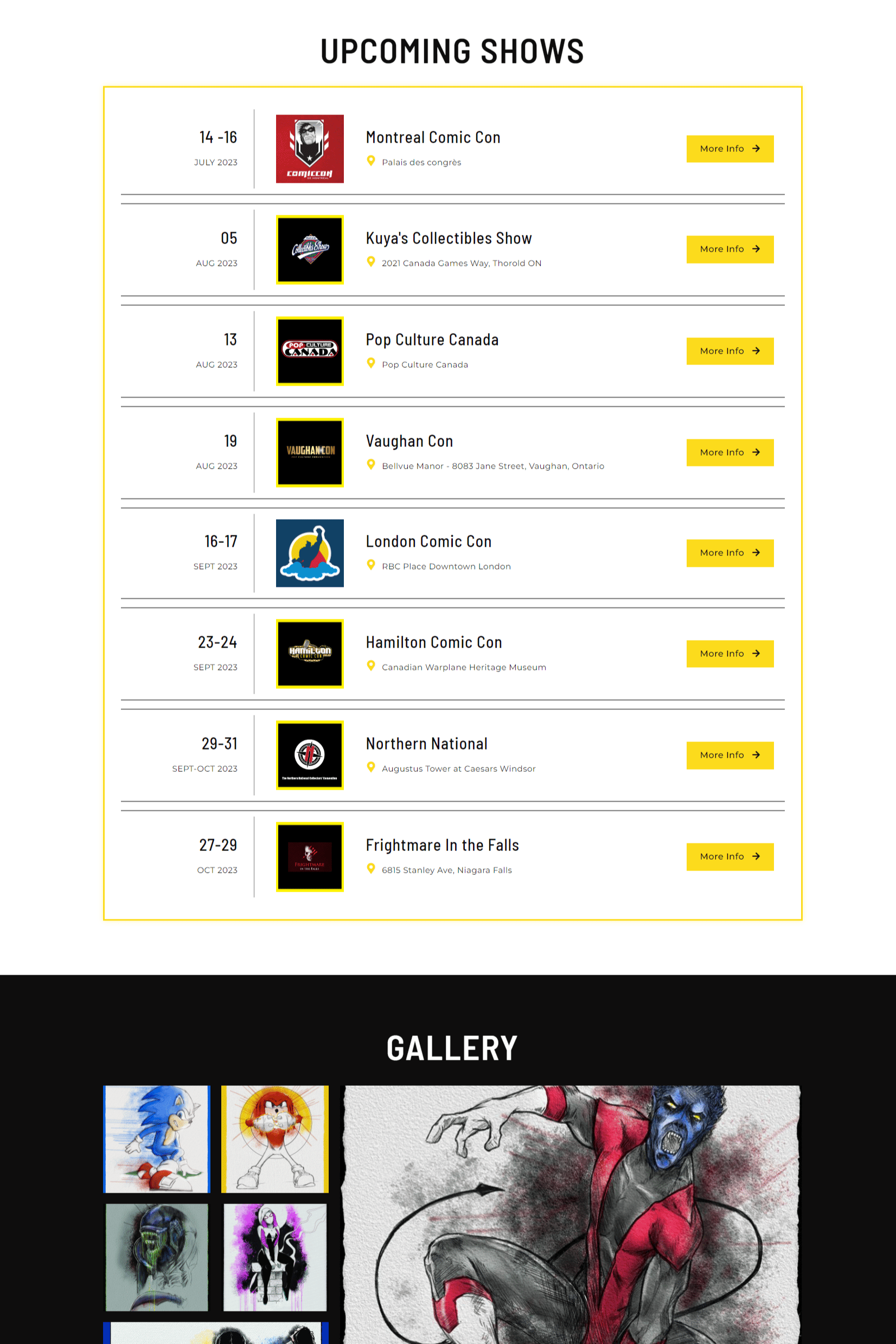
| As an artist, I need a platform where followers can see a list of all the events I’ll be attending throughout the year. | Implement a custom event calendar that showcases all upcoming events, providing followers with a centralized and easily accessible schedule to plan their attendance, meet the artist in person, and purchase artwork. |
| As an artist, I need a platform to share my charity work and encourage contributions. | Develop a dedicated section highlighting the artist’s charitable initiatives, featuring information about ongoing projects, ways to contribute, and the impact of donations, fostering community engagement and philanthropy. |
Research
In undertaking the research for the Sketch Souldier’s Portfolio Website, a comprehensive approach was adopted to ensure the final product aligned seamlessly with the artist’s goals and expectations, keeping the target audience in mind. The research included various key aspects:
USER NEEDS ANALYSIS
Conducted surveys and interviews with potential users, including art enthusiasts, to understand their preferences and expectations from an artist’s portfolio website.
Analyzed existing artist portfolio websites to identify common features and potential areas for differentiation, as well as gain insights into design trends, user engagement strategies, and functionality.
ACCESSIBILITY CONSIDERATIONS
Reviewed accessibility standards and guidelines to ensure the website catered to users with diverse needs, including those with visual or motor impairments.
Explored technologies and design choices that would enhance accessibility for a broad audience.
FEEDBACK LOOPS
Established early feedback loops with the artist through regular review meetings, ensuring alignment with their vision and incorporating iterative improvements based on their input.
Conducted usability testing with potential users to gather feedback on the website’s navigation, content presentation, and overall functionality.

USER JOURNEY MAPPING
Mapped out the anticipated user journey from entering the website to exploring the portfolio and interacting with the event calendar.
Identified potential pain points and areas for improvement in the user experience.
CONTENT STRATEGY
Collaborated closely with the artist to define a robust content strategy, ensuring that the portfolio effectively communicated the artist’s unique style and presented information in a clear and engaging manner.
Explored content creation strategies that would resonate with the artist’s target audience.
Site Overview
In order to meet the client’s specific requirements, certain considerations had to be made.
LANDING ON THE HOMEPAGE
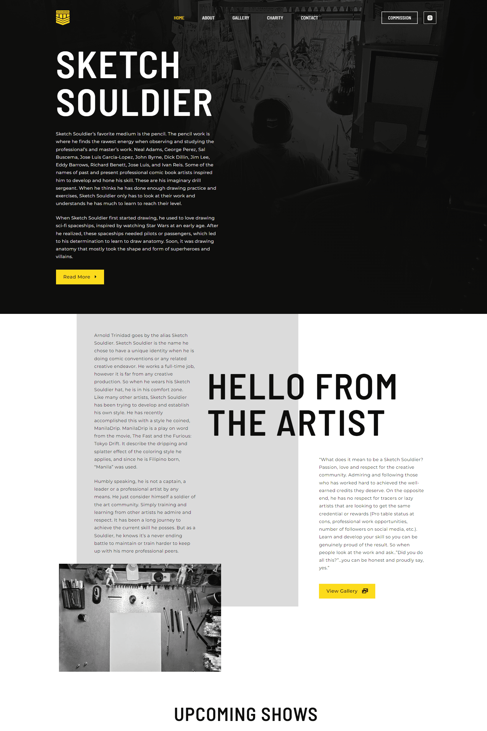
When users visit the website URL, they should be taken directly to the home page
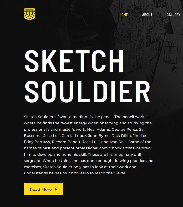
Users arrive at the homepage, greeted by a visually striking design that reflects the artist’s style.
A concise introduction welcomes visitors and sets the tone for the artistic experience.
SOCIAL MEDIA INTEGRATION
Clear calls-to-action and social media links encourage users to connect with the artist on various platforms.
Integration with social media ensures that users can stay updated on the artist’s latest works, events, and initiatives.
GETTING TO KNOW THE ARTIST
A prominent “Hello from the artist” section invites users to delve deeper into the artist’s background, inspirations, and journey.
Personal anecdotes and a compelling narrative humanize the artist, fostering a connection between the creator and the audience.
NAVIGATING THE EVENT CALENDAR
Users discover the custom event calendar, prominently featured on the website.
The calendar displays all upcoming events, allowing users to plan their attendance, learn about the artist’s schedule, and explore opportunities to meet in person.
EXPLORING THE PORTFOLIO
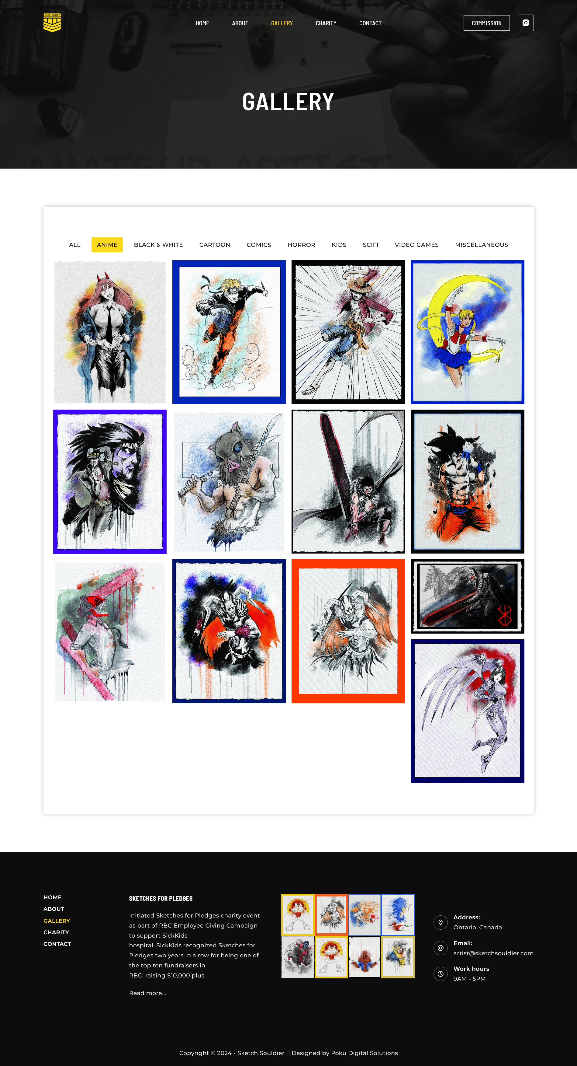
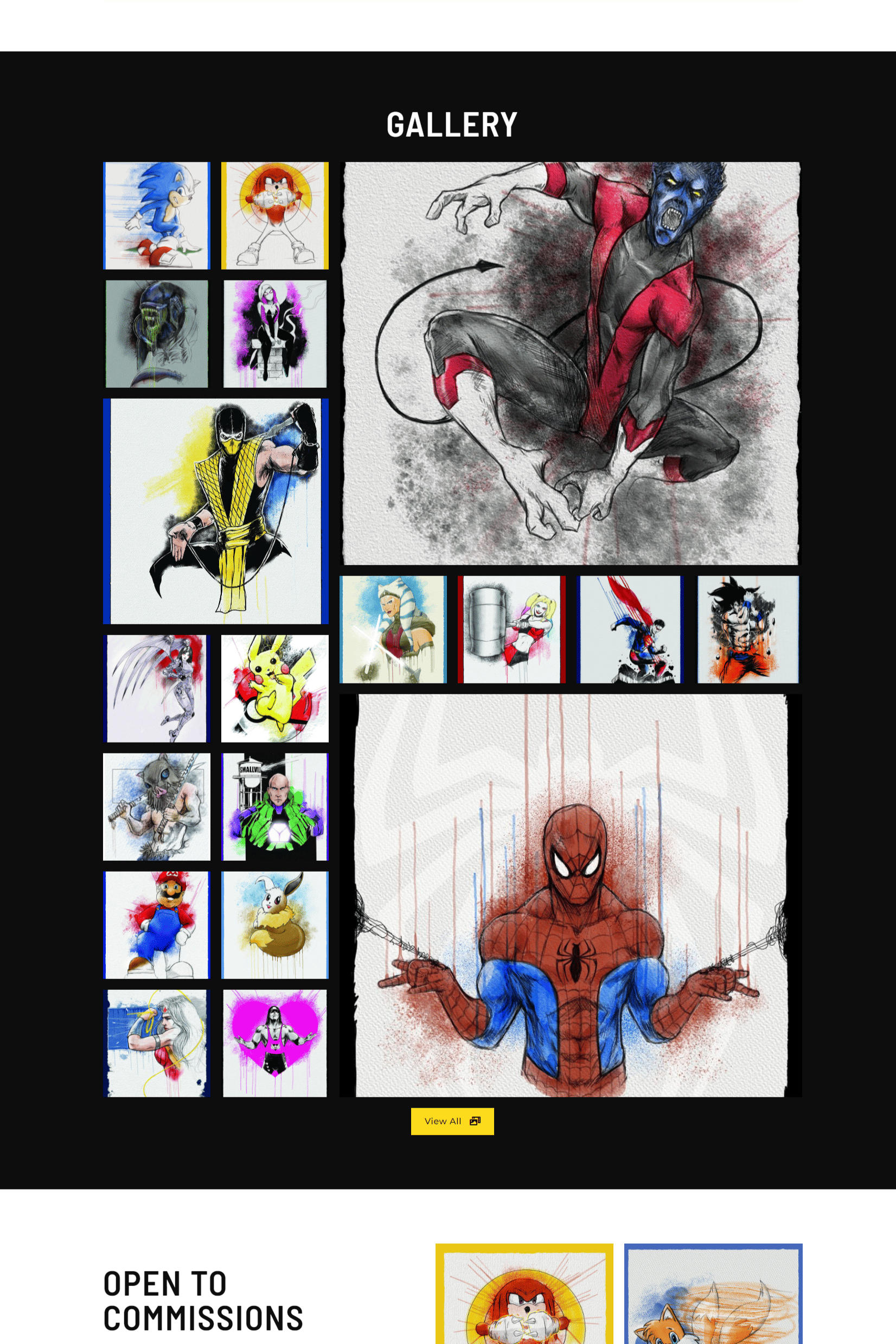
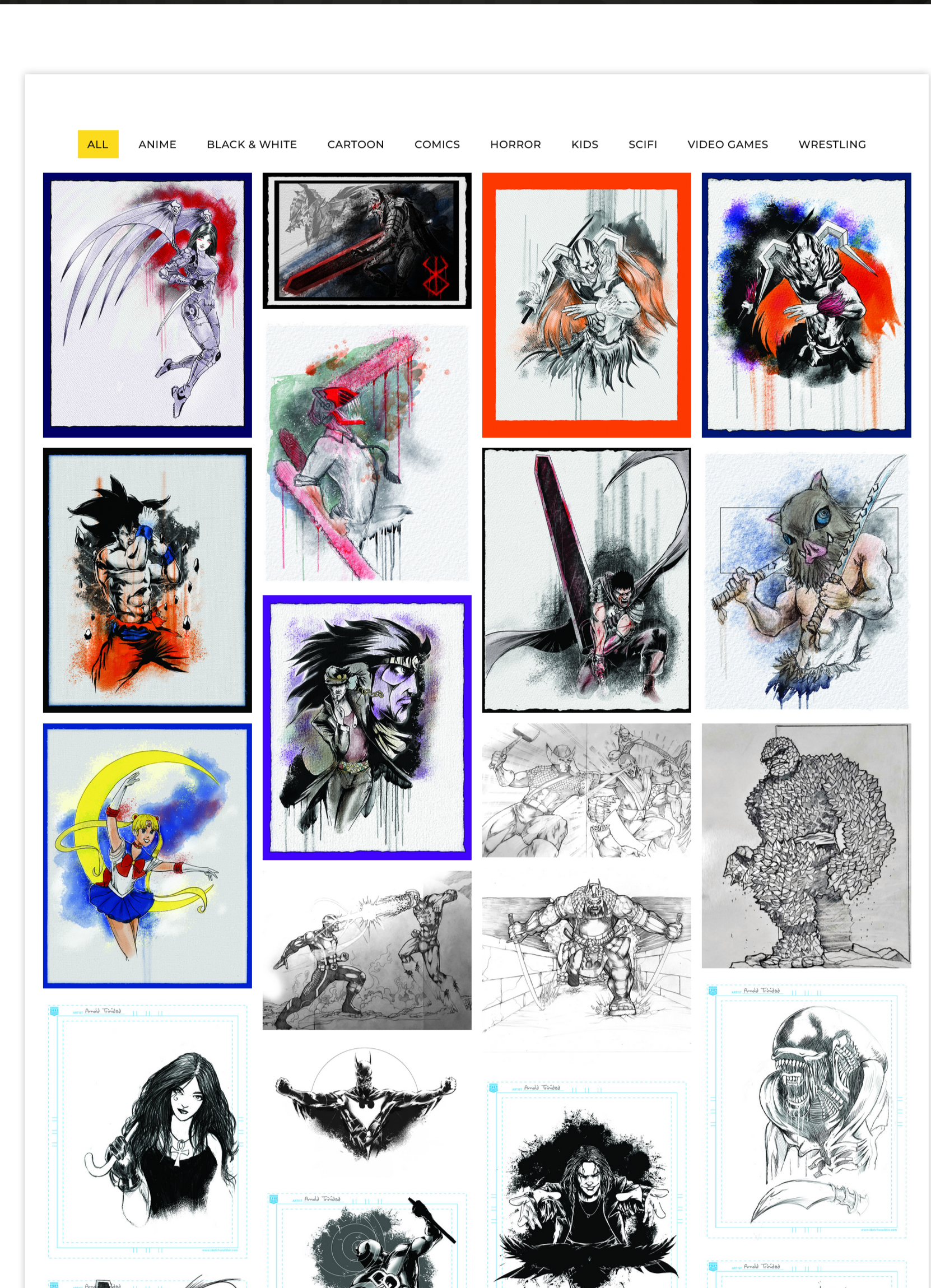
Users navigate to the portfolio section, where a well-organized display showcases a diverse range of the artist’s sketches.
A “View All” button is featured to allow visitors to see all the artist’s sketches organized in different categories
The Gallery page uses lazy loading to display only a number of sketches at a time as the user scrolls, thereby improving speed.
COMMISSIONING ARTWORK
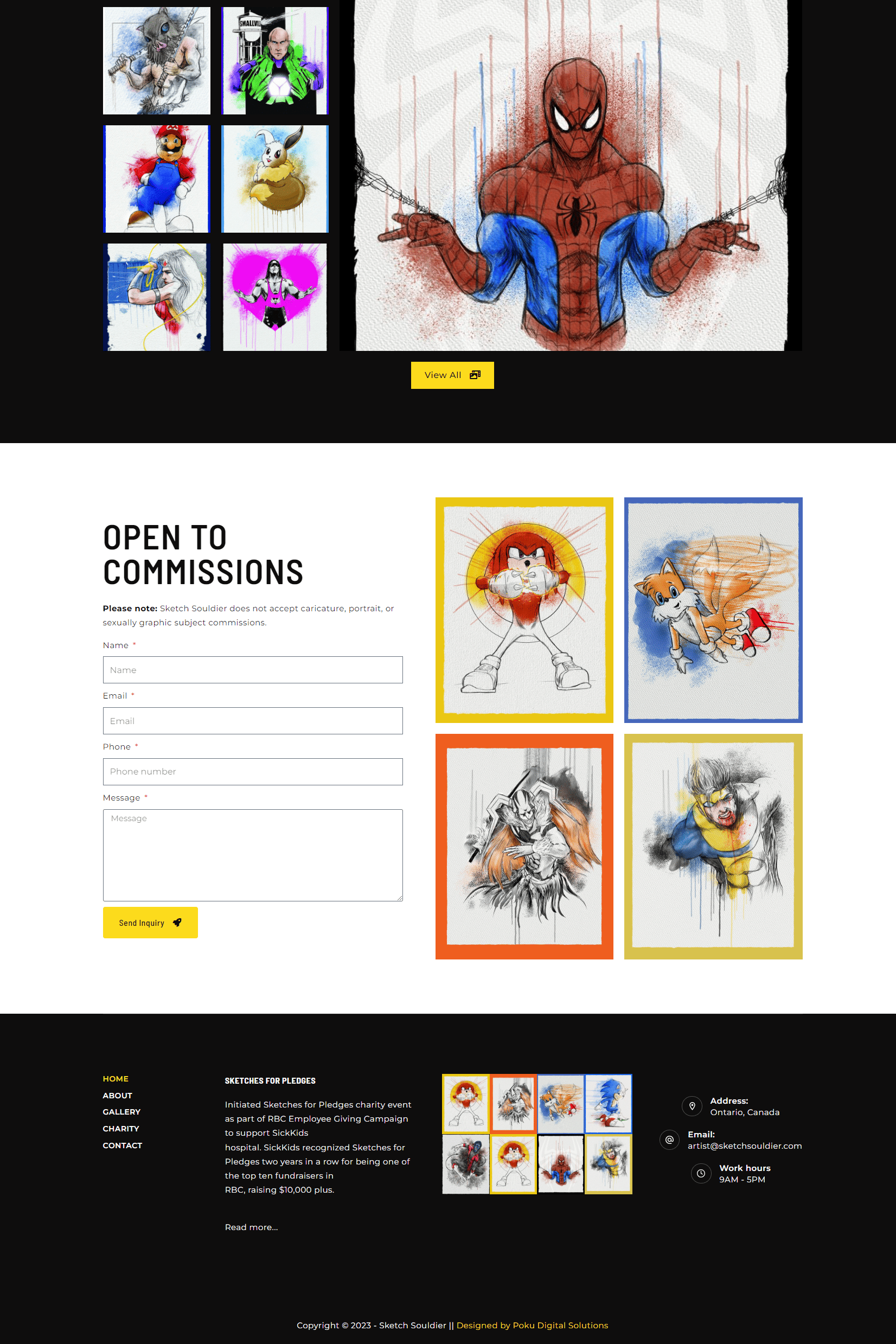
Users interested in personalized artwork seamlessly access the contact form, where they can submit commission inquiries directly.
The form is designed to be user-friendly, prompting users to provide essential details for a streamlined commissioning process.
ENGAGING WITH CHARITY INITIATIVES
A dedicated section highlights the artist’s charity work and encourages users to contribute to ongoing initiatives.
Information about charitable projects, impact stories, and ways to contribute are readily accessible, fostering community engagement.
Design Process
Considering the time constraints (3 months), the design and development process had to be done expeditiously.
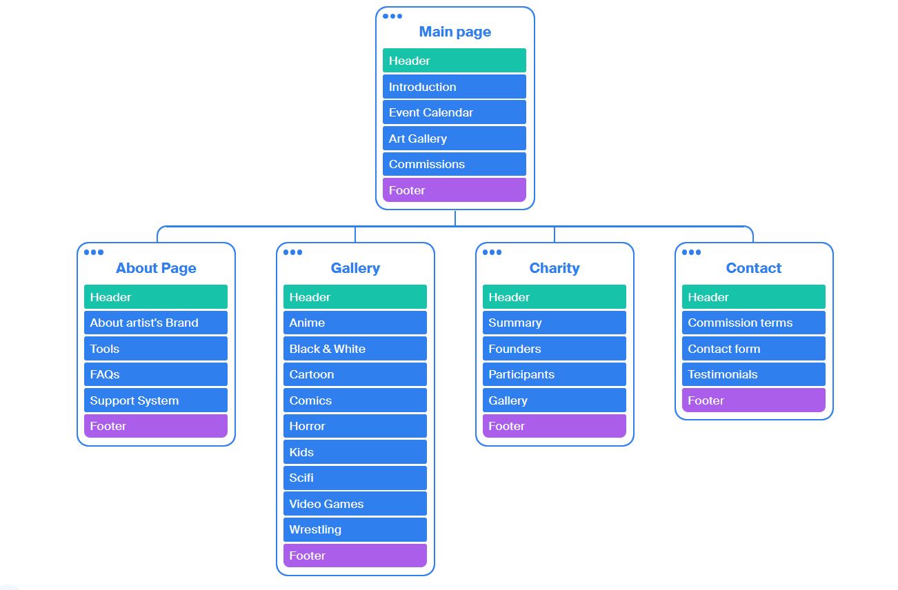
SITE MAP
This site map, informed by surveys and interviews, organizationally depicts the key features that the site would focus on:
- Getting to know the artist
- Learning about events the artist will be attending
- Exploring the artists works
- Contacting the artist for custom commissions
- Learning about the artist’s charity
The framework the site map provides, along with the user insight collected thus far, would guide design decisions moving forward.
COLOR PALETTE
The selection of the color palette was a deliberate choice aimed at aligning the website with the artist’s brand identity. The combination of black, white, grey, and yellow was carefully chosen to evoke a specific emotional response.
Black and white create a timeless and sophisticated base, providing a neutral backdrop to showcase the artist’s vibrant sketches.
Grey adds depth and serves as a harmonizing element.
The introduction of yellow injects energy and vibrancy into the design, adding a pop of color that reflects the artist’s creativity.
This combination not only exudes a calm and artistic ambiance but also infuses an energetic vibe, perfectly mirroring the essence of the artist’s work.
FONT SELECTION
Barlow Semi Condensed and Montserrat fonts were chosen with precision to complement the overall design aesthetic.
Barlow Semi Condensed, with its modern and geometric qualities, adds a touch of sophistication to headers and prominent elements.
Montserrat, known for its readability and versatility, ensures clear and legible text throughout the website.
The combination of these fonts contributes to a cohesive and contemporary typographic style that resonates with the artist’s brand and enhances the overall visual harmony.
PORTFOLIO PAGE
The portfolio section boasts an interactive design with special effects triggered upon user hover. This feature enhances user engagement and provides a dynamic experience while exploring the artist’s sketches.
Additionally, the implementation of portfolio filtering allows users to easily categorize sketches, providing a tailored and organized viewing experience.
WHITE SPACE
The intentional incorporation of ample white space in the design serves multiple purposes.
Firstly, it enhances the overall visual appeal by providing breathing room around key elements, allowing the content to stand out.
Secondly, white space contributes to a clean and minimalist aesthetic, aligning with the artist’s desire for a sophisticated presentation.
The judicious use of white space not only promotes readability and clarity but also adds an element of elegance to the overall user experience.
PERFORMANCE OPTIMIZATION
The website has been optimized for performance across various devices, ensuring a seamless user experience. Lazy loading has been incorporated to enhance loading times, allowing for a smooth and efficient navigation experience for visitors, irrespective of the device they use.
DYNAMIC CONTENT UPDATES
The website was developed using WordPress, Elementor, PHP and CSS, in a manner to ensure that the artist can effortlessly add new sketches, update the portfolio, and manage events in real-time without requiring extensive development support. This flexibility ensures that the website stays current and reflective of the artist’s evolving body of work and schedule.
Every design choice made in the development of this project was guided by a thoughtful consideration of the artist’s brand identity, the desired emotional impact, and the need for a seamless user experience. The collaboration between wireframing, development, and iterative review cycles ensured that the final product not only met functional requirements but also embodied the artistic essence of the client.
The possibility of integrating a live social media feed directly into the website can be explored. This would provide visitors with real-time updates from the artist’s social platforms, fostering a sense of community engagement and keeping the content fresh.
Detailed descriptions or stories could be added to accompany each artwork in the portfolio. This will not only add depth to the artistic narrative but also provide visitors with insights into the inspiration and creative process behind each piece.
Introducing social sharing buttons on individual artwork could encourage visitors to share their favorite pieces across social media platforms. This can amplify the artist’s reach and foster a sense of community among followers.
A robust Search Engine Optimization (SEO) strategy can enhance the website’s visibility on search engines. This will include optimizing meta tags, image alt text, and ensuring that relevant keywords are strategically incorporated throughout the content.
A feedback mechanism could be introduced for users to share their thoughts on the website, provide input on their favorite features, and suggest improvements. This will not only foster community engagement but also offer valuable insights for future enhancements.
Possible improvements
Issues to Address for Longer-Term Development

Relection
Every project comes with its unique challenges and navigating these always gives way for teachable moments. The lessons learned from this project underscore the importance of collaboration, adaptability, and a user-centric approach in delivering a successful and engaging online platform.
COLLABORATIVE WIREFRAMING
The collaborative approach to wireframing, involving the artist in the early stages, was invaluable. It facilitated a shared understanding of the website’s structure and minimized misunderstandings later in the development process.
Takeaway: Prioritize collaborative discussions during the initial planning stages to align with the client’s vision and streamline subsequent development.
USER FEEDBACK
User feedback, particularly during testing phases, provided valuable insights into user preferences and potential enhancements.
Takeaway: Actively seek and welcome user feedback as it offers a user-centric perspective, guiding ongoing improvements and refinements.
ITERATIVE DEVELOPMENT AND TESTING
The decision to transition swiftly from wireframes to development due to time constraints necessitated frequent iterative testing. Regular review cycles allowed for real-time adjustments, ensuring that the final product met functional requirements.
Takeaway: Embrace an agile development approach, incorporating iterative testing and continuous client feedback to address evolving needs and preferences.
ADAPTABILITY TO CLIENTS' EVOLVING NEEDS
The project’s success hinged on the team’s adaptability to the artist’s evolving needs and preferences throughout the design and development process.
Takeaway: Embrace a flexible approach, being responsive to client feedback and ready to pivot strategies as the project unfolds.
